It is the most common heart-stopping moment in design. You spend hours perfecting a brochure on your laptop. The blues are electric, the oranges are vibrant, and the photos look crisp. You send the file to print, and when you get the proof back... it looks different.
The blue is a little duller. The orange isn't quite as neon. You might think the printer made a mistake.
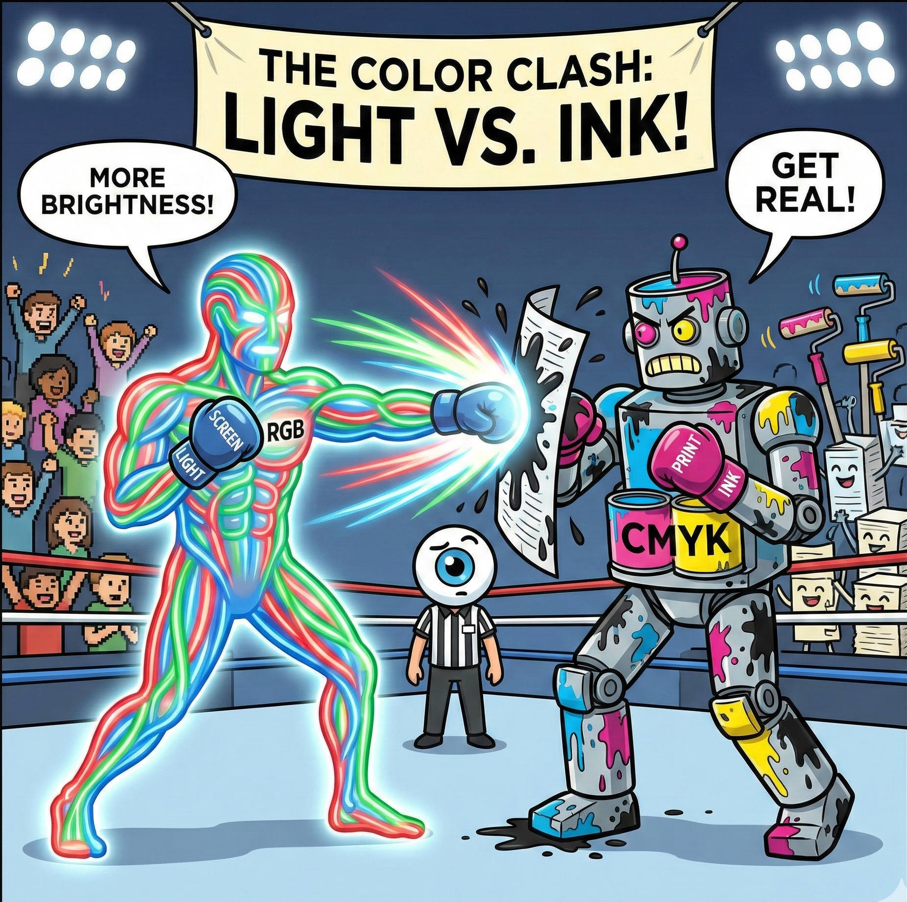
At Trojan Press, we want you to know that the printer didn't make a mistake—physics did. The reason for the shift is that your computer monitor and our printing press speak two completely different languages: RGB and CMYK.
RGB: Painting with Light
Your computer monitor, smartphone, and TV all use the RGB color mode. This stands for Red, Green, and Blue.
Because your screen is a light source, it starts with black (a turned-off screen) and adds light to create color. This is called "Additive Color."
- If you mix Red and Green light, you get Yellow.
- If you mix Red, Green, and Blue light together at 100% intensity, you get pure White.
The Trap: Because screens project light directly into your eyeballs, they can create incredibly bright, neon, and saturated colors that simply do not exist in the physical world of ink and paper.
CMYK: Painting with Ink
Printers, including the presses at Trojan Press, use the CMYK color mode. This stands for Cyan, Magenta, Yellow, and Key (Black).
[Image of CMYK subtractive color mixing diagram]
Paper doesn't emit light; it reflects it. We start with white paper and add ink to block (subtract) the white light from reflecting back at you. This is called "Subtractive Color."
- If you mix Cyan and Yellow ink, you get Green.
- If you mix Cyan, Magenta, and Yellow together, you don't get white—you get a muddy dark brown. This is why we have to add a fourth ink, Black (Key), to create crisp text and deep shadows.
The "Gamut" Gap
The range of colors a device can produce is called its "Gamut." The RGB gamut (screen) is much wider than the CMYK gamut (print).
Think of RGB as a box of 100 crayons, and CMYK as a box of 70 crayons. There are colors on your screen—especially bright neon greens, electric blues, and hot pinks—that simply cannot be created by mixing ink. When you print an image containing these "out of gamut" colors, the printer has to find the closest possible match, which often looks duller than the screen version.
Pro Tip: The Secret of "Rich Black"
Here is a trick professional designers use to make print look premium. In design software, if you set a background to 100% Black (K), it often looks like a dark charcoal gray when printed.
To get a truly deep, midnight black, designers use a mixture called Rich Black. By adding a splash of the other colors under the black ink, the result is much darker and glossier.
A standard Rich Black formula:
- Cyan: 60%
- Magenta: 40%
- Yellow: 40%
- Black: 100%
(Note: Never use Rich Black for small text, or it may look blurry. Keep small text 100% Black only.)
The Takeaway
To avoid surprises, always set your design software (InDesign, Illustrator, or Photoshop) to CMYK mode before you start designing. This forces the screen to simulate what the inks will look like, keeping your expectations realistic and your final print looking exactly how you imagined.
Related Articles
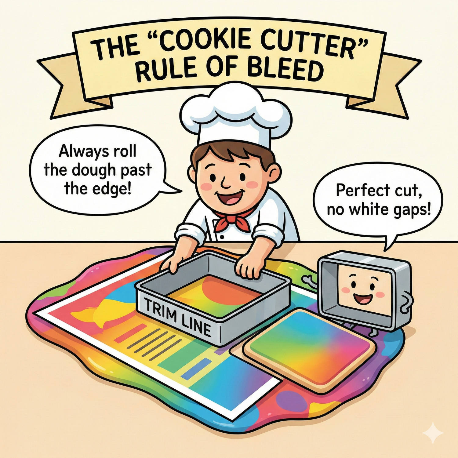
Living on the Edge: Why "Bleed" is Vital for Perfect Print
You have designed a stunning flyer. The background is a beautiful, edge-to-edge photograph. You print it on your office printer, and out it comes with a thin, ugly white border around the edge. You think: "Professional printers can fix this. They can print right to the edge."
Read article →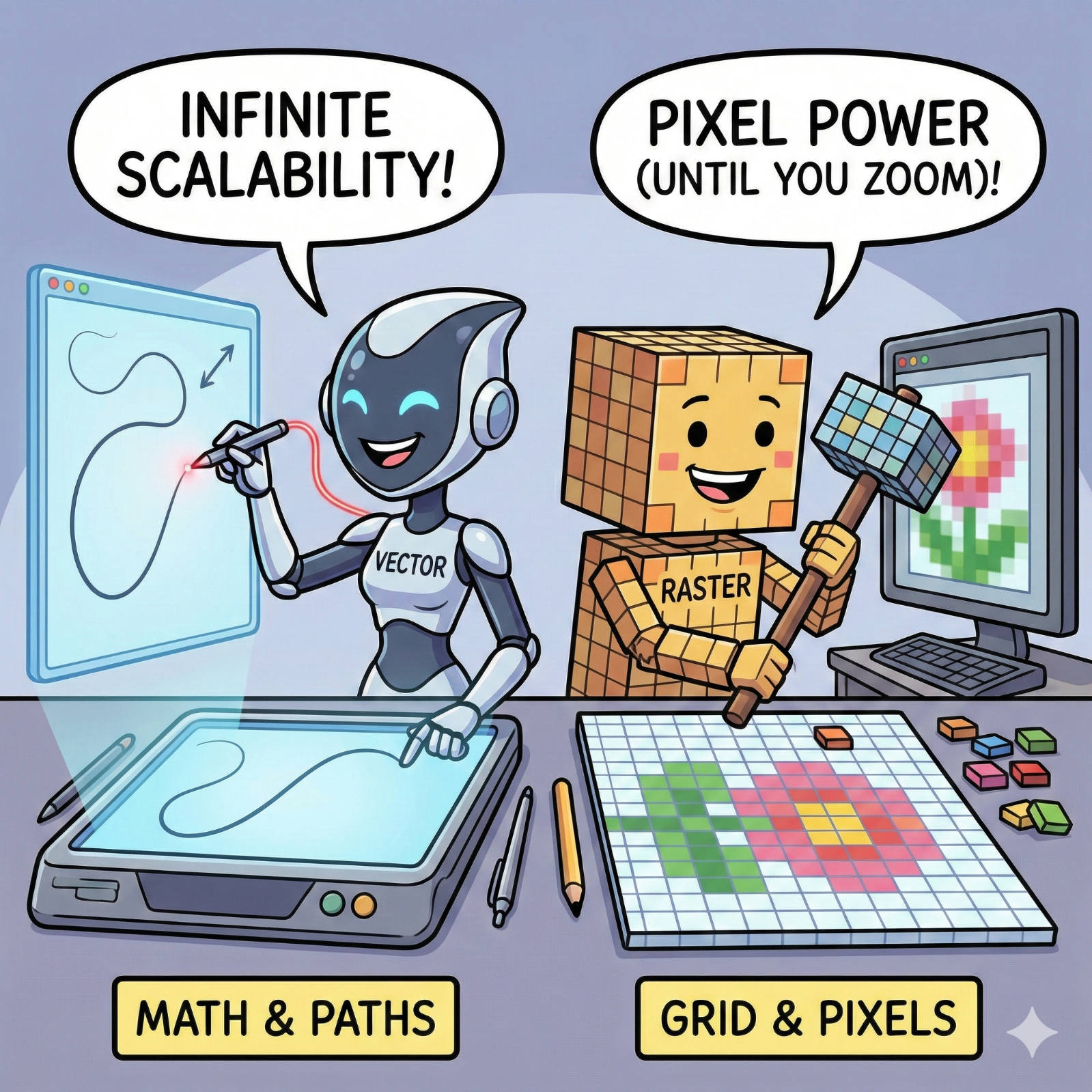
The Fuzzy Logo Mystery: Vector vs. Raster Explained
We have all seen it: a large banner or sign where the company logo looks like it was built out of blurry LEGO blocks instead of crisp lines. It’s a common frustration, but it’s rarely a printer error. It is almost always a file error.
Read article →
The Invisible Ruler: Decoding the "Point" in Typography
Every day, millions of people open a word processor, click a dropdown menu, and select a number: 10, 11, maybe 12. We know that 12 makes the letters bigger than 10, but rarely do we stop to ask: 12 what?
Read article →