Every day, millions of people open a word processor, click a dropdown menu, and select a number: 10, 11, maybe 12. We know that 12 makes the letters bigger than 10, but rarely do we stop to ask: 12 what?
We aren't measuring in millimeters, and we certainly aren't measuring in pixels. We are using Points—a physical unit of measurement that dates back centuries, hidden in plain sight on our modern screens.
At Trojan Press, we believe understanding the mechanics of print leads to better design. Here is the breakdown of the measurement you use every day without realizing it.
The Magic Number: 72
In the world of modern digital printing and desktop publishing, the math is surprisingly clean:
There are exactly 72 points in one inch.
This means that when you select a "72-point" headline size, you are asking for letters that take up roughly one vertical inch of space. Consequently, standard 12-point text is exactly 1/6 of an inch tall.
The Power of the Pica
While the point is the atom of typography, the Pica is the molecule. Points are often too small to use when calculating page margins or column widths, so printers group them together.
- 12 Points = 1 Pica
- 6 Picas = 1 Inch
If you have ever wondered why professional design software (like InDesign) sometimes displays measurements like 4p6, it isn't a glitch. It reads as "4 picas and 6 points." It is the imperial system’s typographic cousin—a way to divide space into manageable, base-12 chunks that are easy to divide mentally.
A Brief History: The Digital Shift
For a long time, the point wasn't exactly 1/72 of an inch. In the era of metal type, the "American Point" was approximately 0.0138 inches, resulting in about 72.27 points per inch. Meanwhile, Europe used the "Didot" point, which was slightly larger.
This changed in the 1980s with the desktop publishing revolution. When Adobe and Apple developed the PostScript language (the code that tells printers what to put on a page), they needed to simplify the math for computers. They rounded the point to exactly 1/72 of an inch.
This became known as the DTP (Desktop Publishing) Point, and it is the standard used by Microsoft Word, Adobe Creative Cloud, and Trojan Press today.
Why "Leading" Matters
Understanding points also explains line spacing. You might see a setting like 12/14.4 or "Single Spacing."
In the days of metal type, printers would insert thin strips of lead between the rows of metal letters to space them out. This was literally called "leading" (pronounced led-ding).
If you have 12-point text, you usually need a little breathing room so the lines don't touch. A standard default is 120% of the font size.
- Font Size: 12 points
- Leading: 14.4 points
The Takeaway
Next time you adjust your font size, remember that you aren't just selecting an arbitrary scale factor. You are utilizing a precise, physical ruler that has been standardized for the digital age—ensuring that what you see on the screen translates perfectly to the printed page.
Related Articles
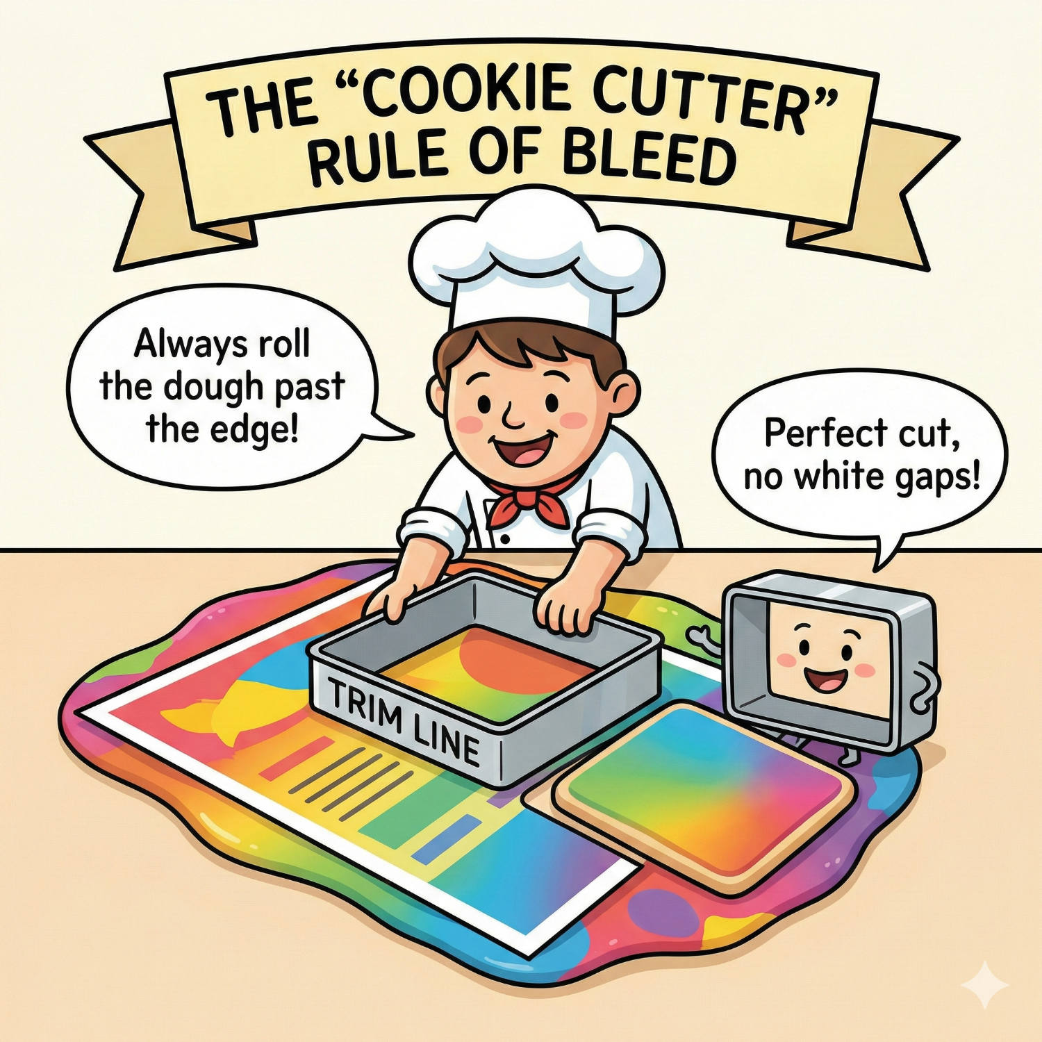
Living on the Edge: Why "Bleed" is Vital for Perfect Print
You have designed a stunning flyer. The background is a beautiful, edge-to-edge photograph. You print it on your office printer, and out it comes with a thin, ugly white border around the edge. You think: "Professional printers can fix this. They can print right to the edge."
Read article →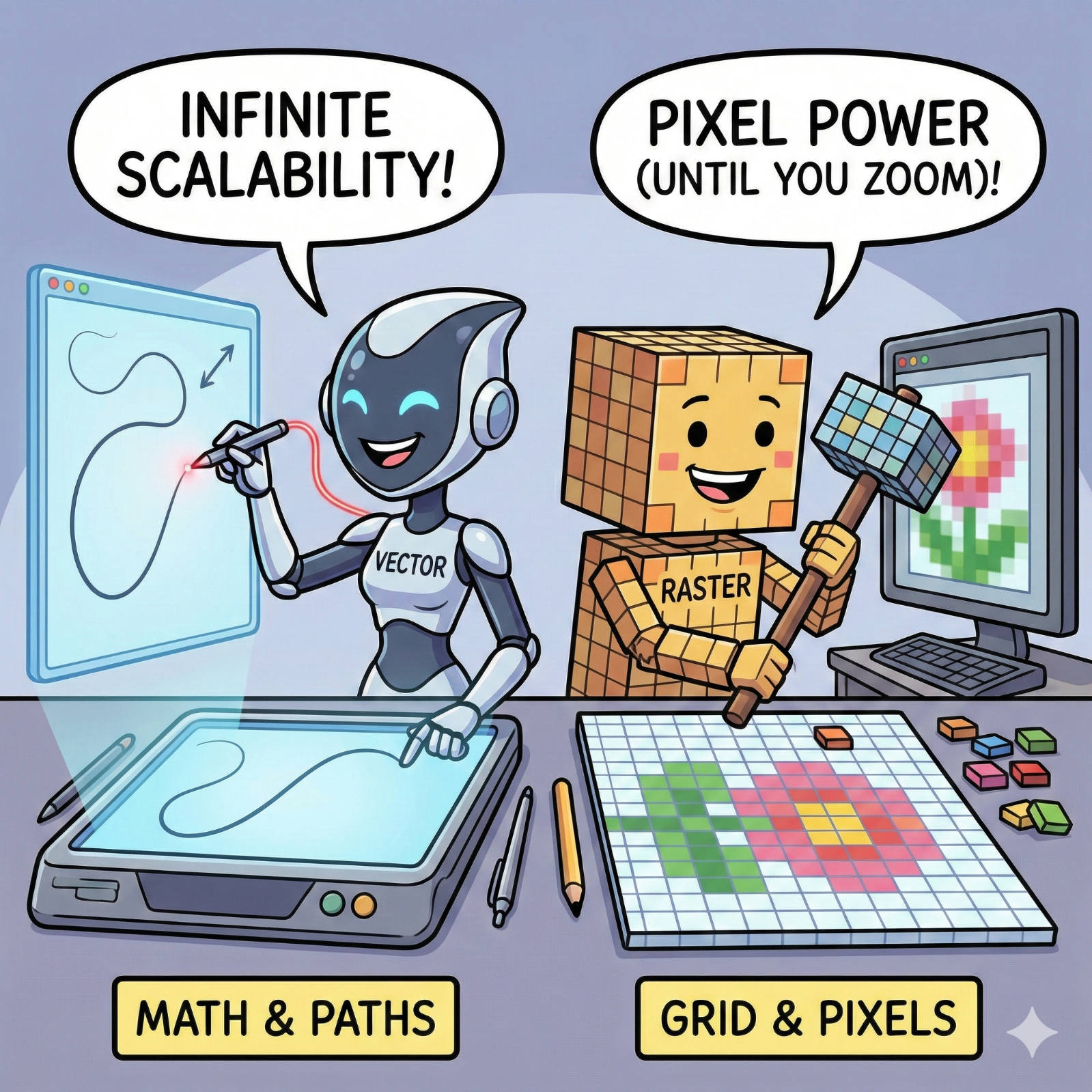
The Fuzzy Logo Mystery: Vector vs. Raster Explained
We have all seen it: a large banner or sign where the company logo looks like it was built out of blurry LEGO blocks instead of crisp lines. It’s a common frustration, but it’s rarely a printer error. It is almost always a file error.
Read article →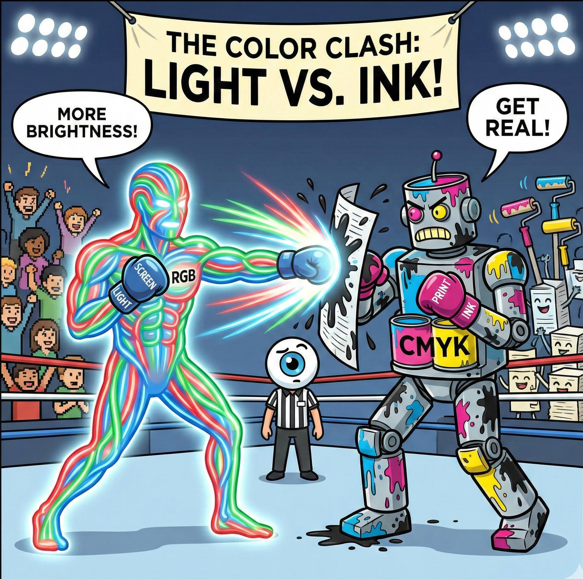
Why Your Screen Lies to You: The Battle Between RGB and CMYK
It is the most common heart-stopping moment in design. You spend hours perfecting a brochure on your laptop. The blues are electric, the oranges are vibrant, and the photos look crisp. You send the file to print, and when you get the proof back... it looks different.
Read article →